datasheet
-
client
Algemeen Ziekenhuis Sint-Maarten -
year
2016/2017 -
location
Mechelen / Belgium -
architecture
VKSTUDIO -
photography
STUDIOMDA Belgium -
collaboration
-
description
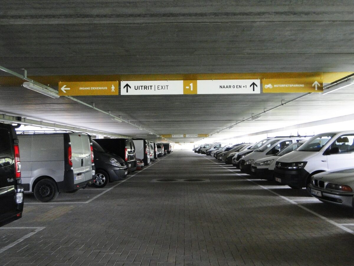
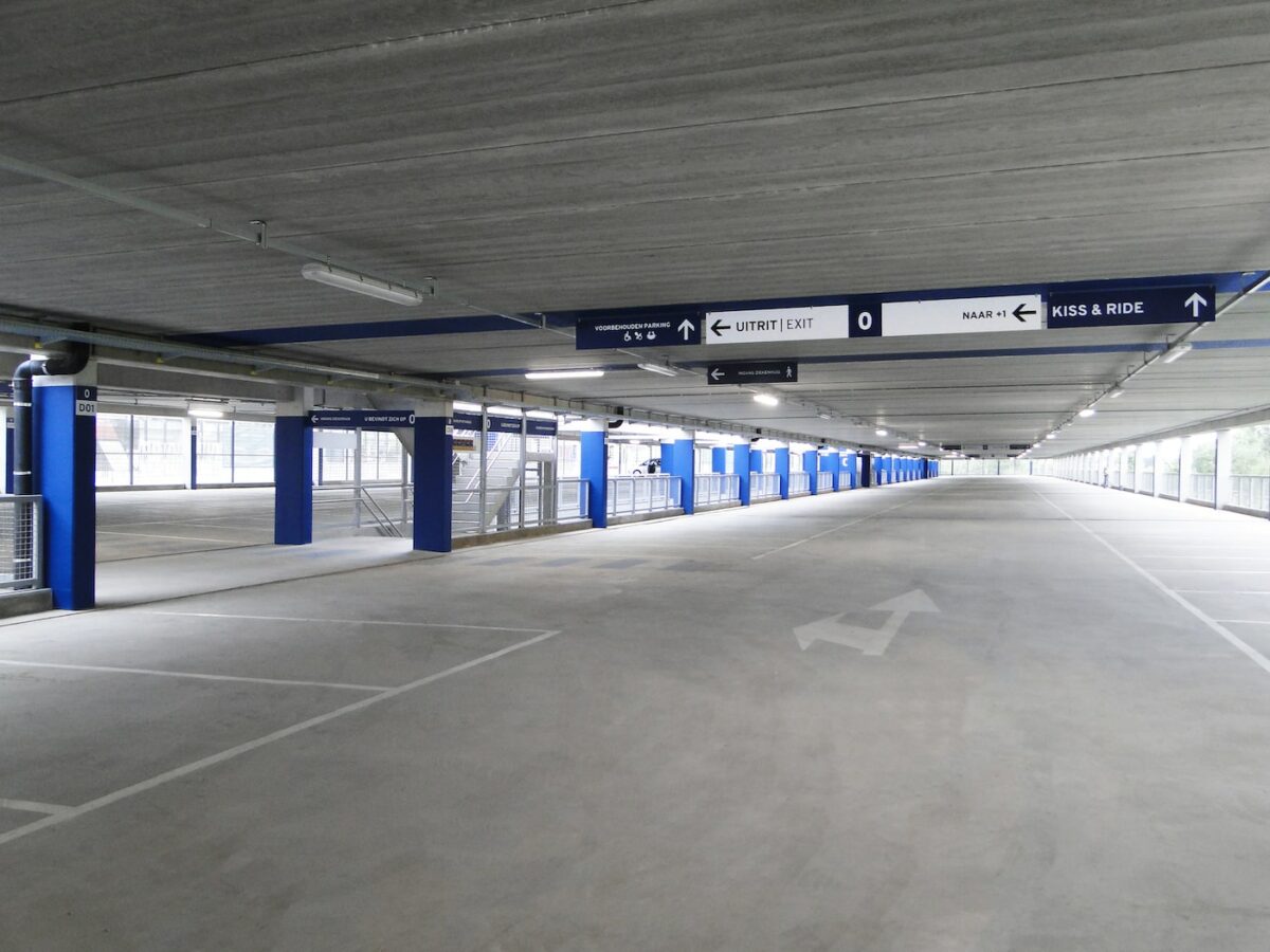
Hospital car parks are quite complex and often large, and thus require a clear layout, convenient routing and thoughtful signage to coordinate a broad range of activity. Visiting a hospital is usually stressful, and wayfinding design presents an opportunity to provide a calmer, more comfortable experience. The three-story car park for the new AZ Sint Maarten in Mechelen, Belgium, is one of the larger examples, accommodating 1600 vehicles.
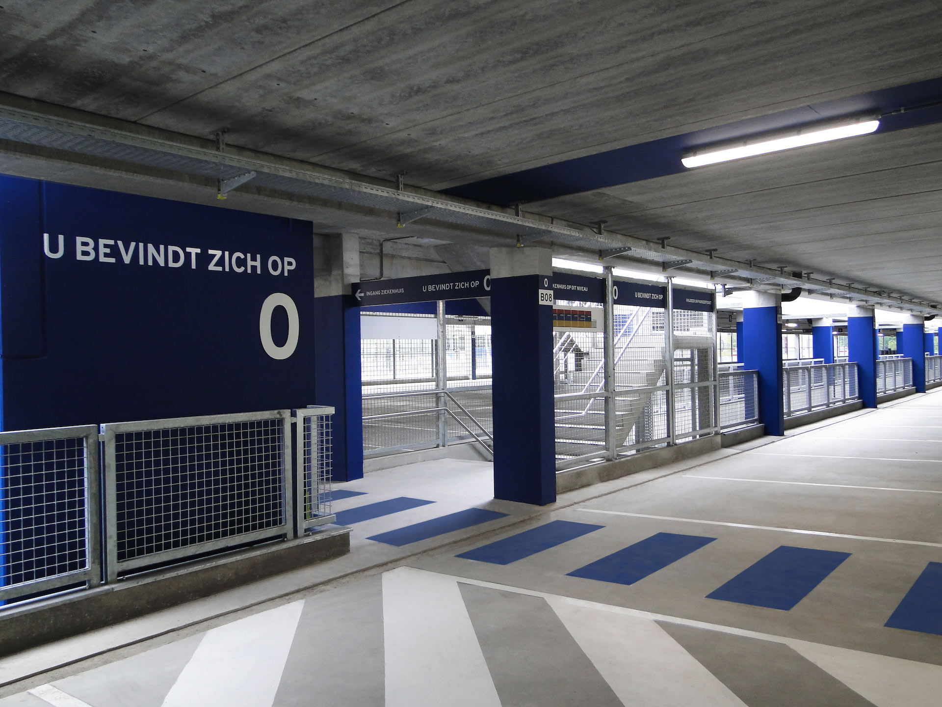
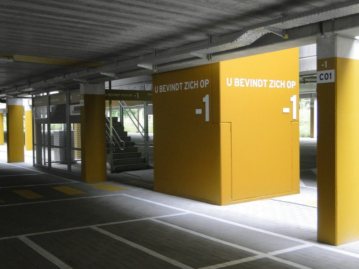
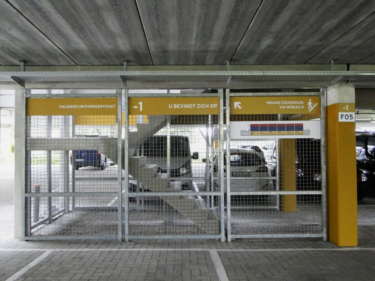
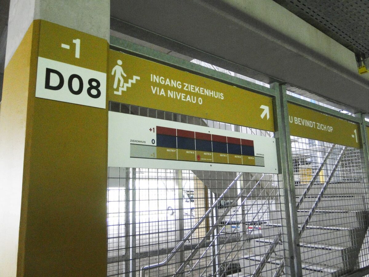
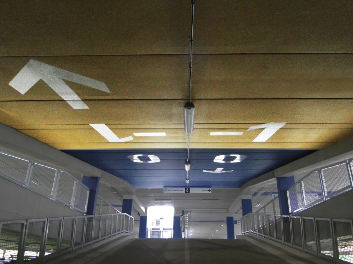
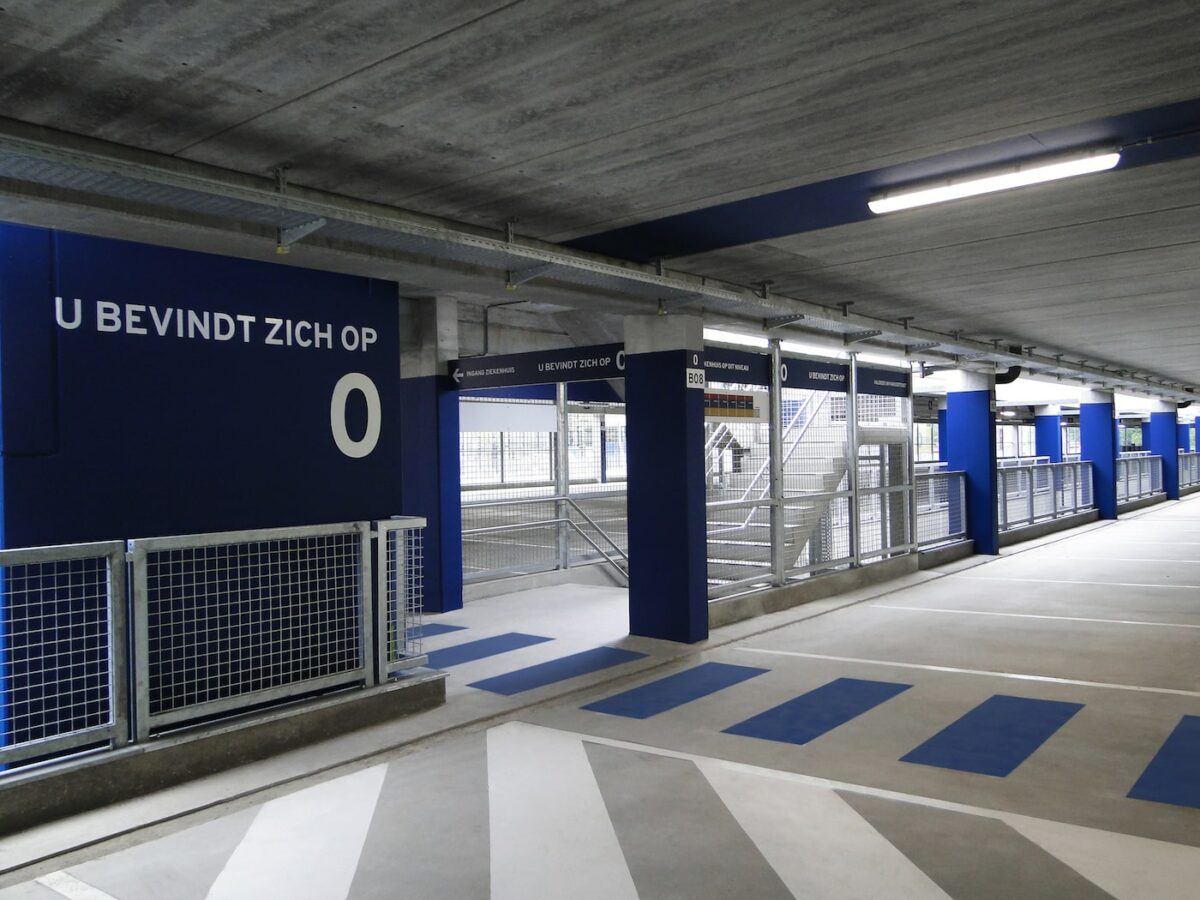
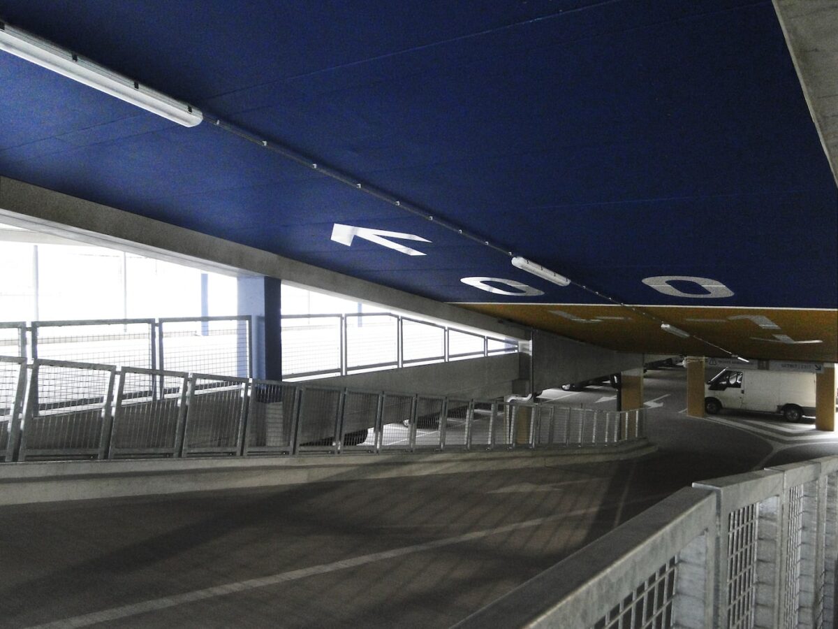
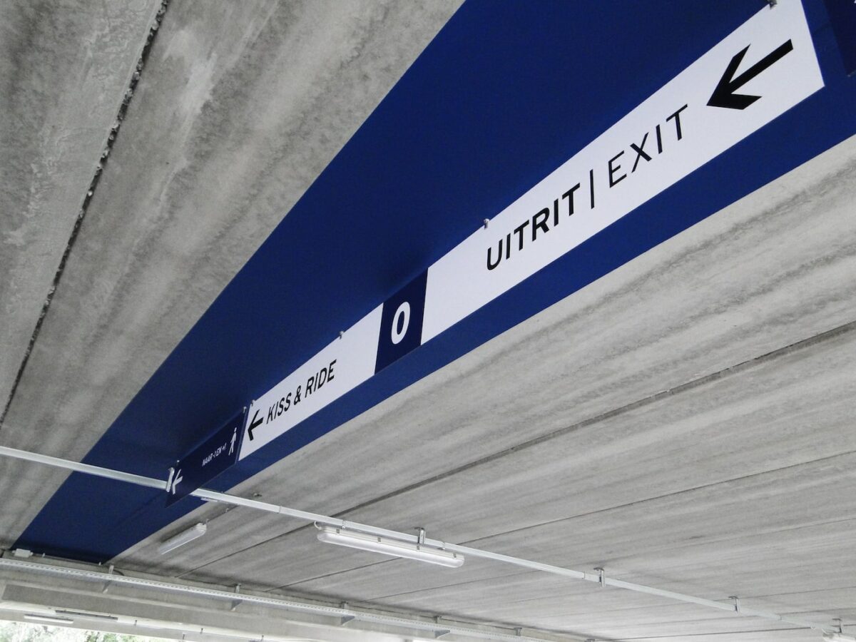
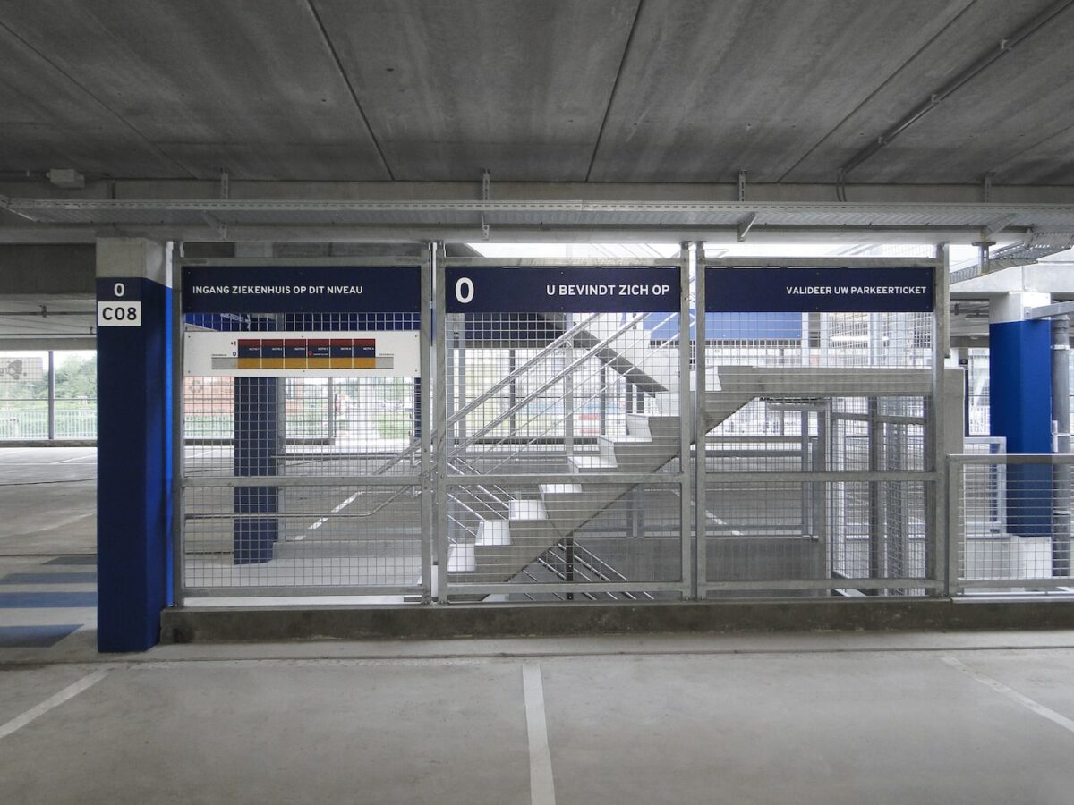
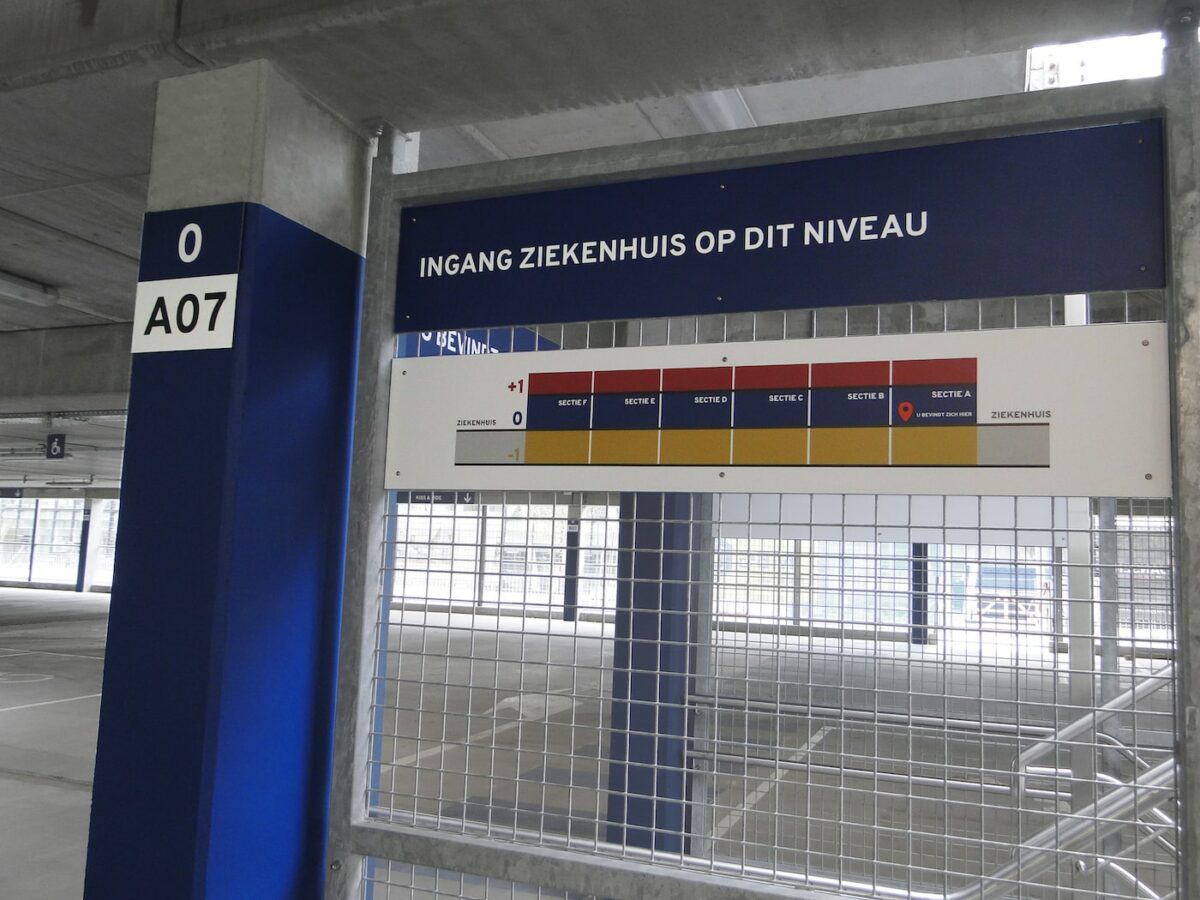
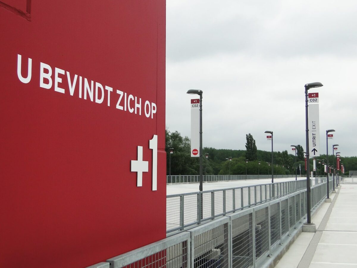
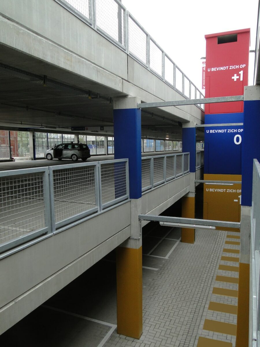
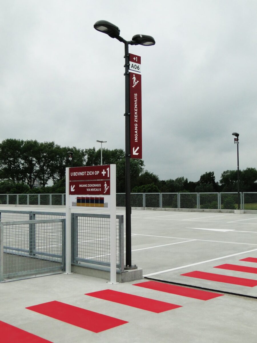
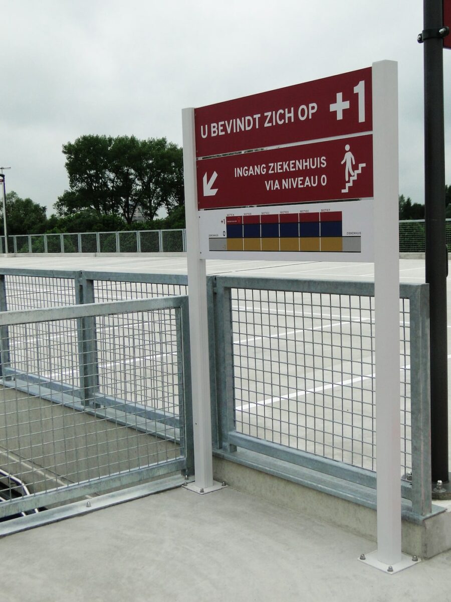
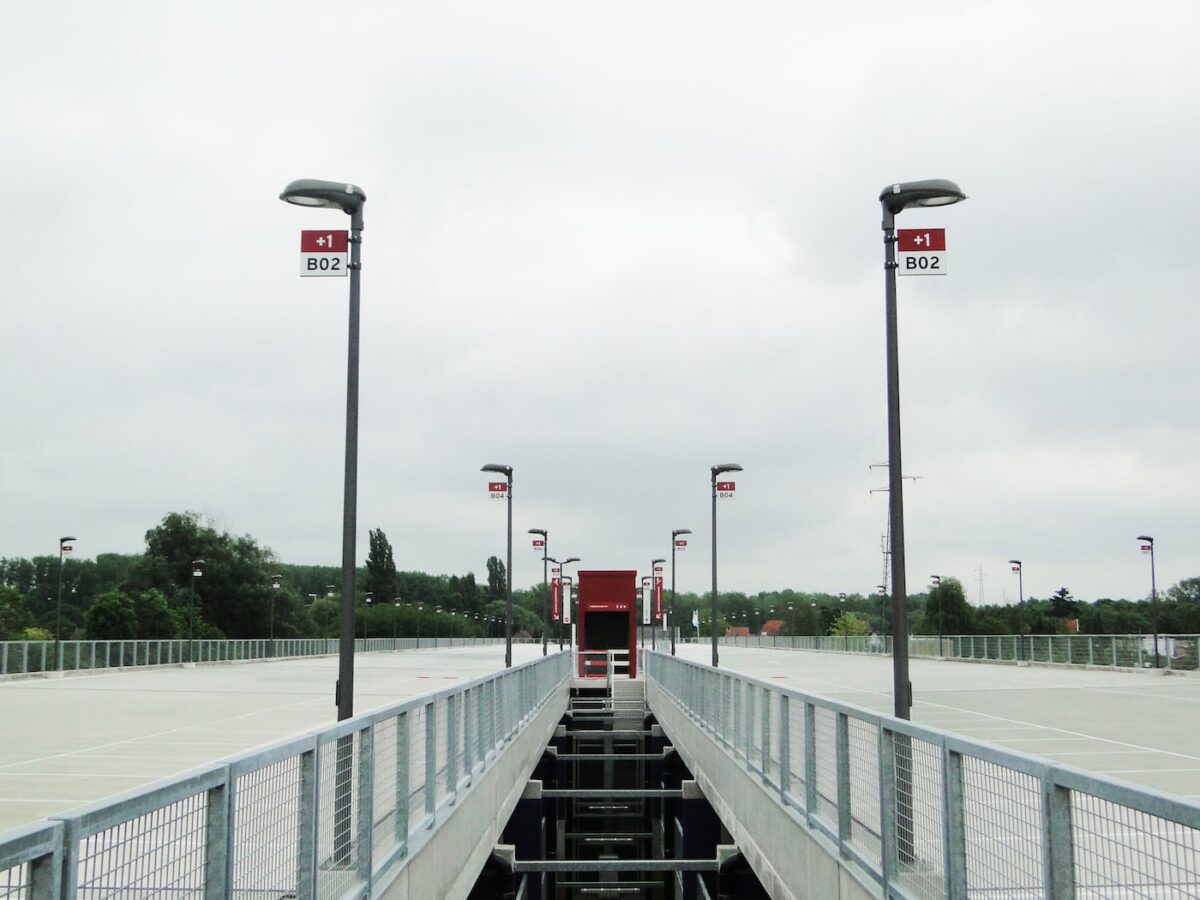
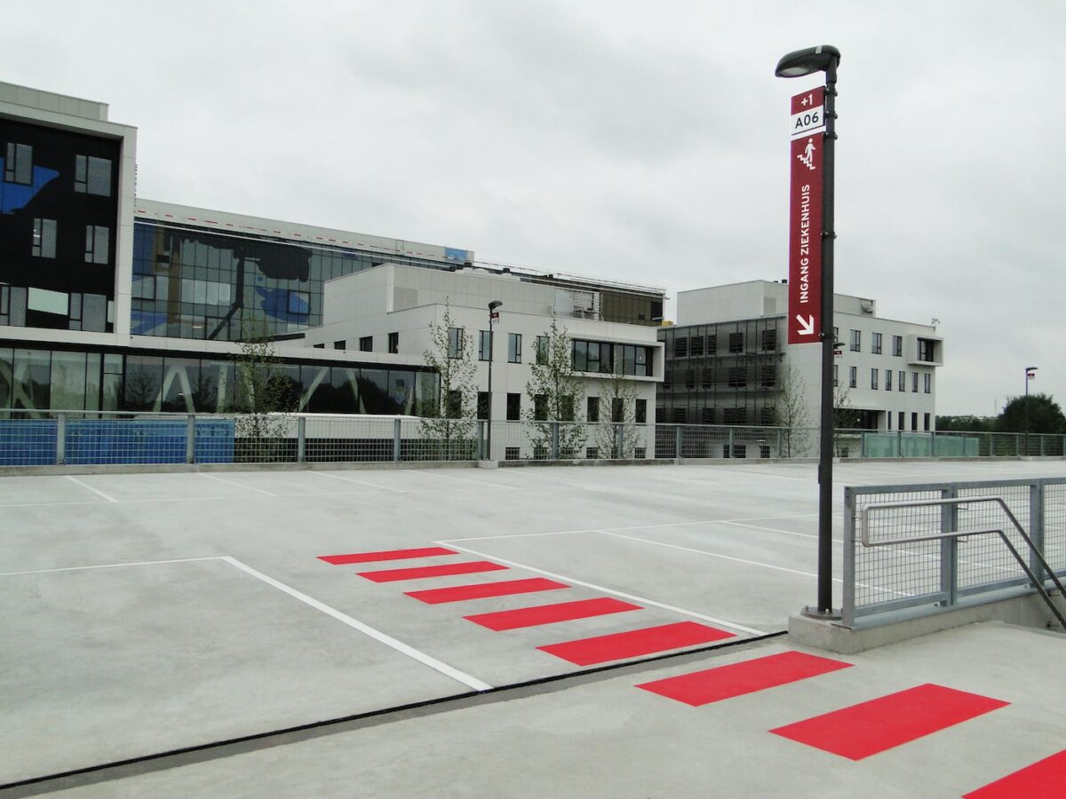
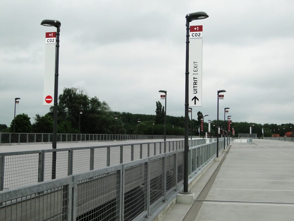
The design takes the needs of its various users into account, including car drivers, pedestrians and cyclists. Key to wayfinding is ensuring that everyone gets the information they need right where they need it. Upon entering, for example, with just a glance it is immediately clear where reserved and special parking areas are located and who can use them. Visitors dropping someone off are greeted with a unique kiss-and-ride zone on level 0.After a thorough study of the parking requirements and surrounding environment, we designed a strategic plan in which colors play an important role. To simplify orientation, we gave each floor a color of its own: dark red, blue or yellow. Not by accident, the colors were taken from the artwork on the hospital’s facade. The walls, pillars and even the ceilings of the passages between floors were colorfully painted so that people would immediately grasp which level they are on. Each floor was divided into zones to make the space visually clear, and each zone was assigned a letter and number to mark off the areas.
In strategic and highly-visible locations we placed information that uses a hierarchy for cars and pedestrians. The legibility of the font, letter size, choice of icons, and their positions and colors: every aspect was examined. Parking must be safe and functional for patients and visitors, and this underscored our entire design for AZ Sint-Maarten.
