datasheet
-
client
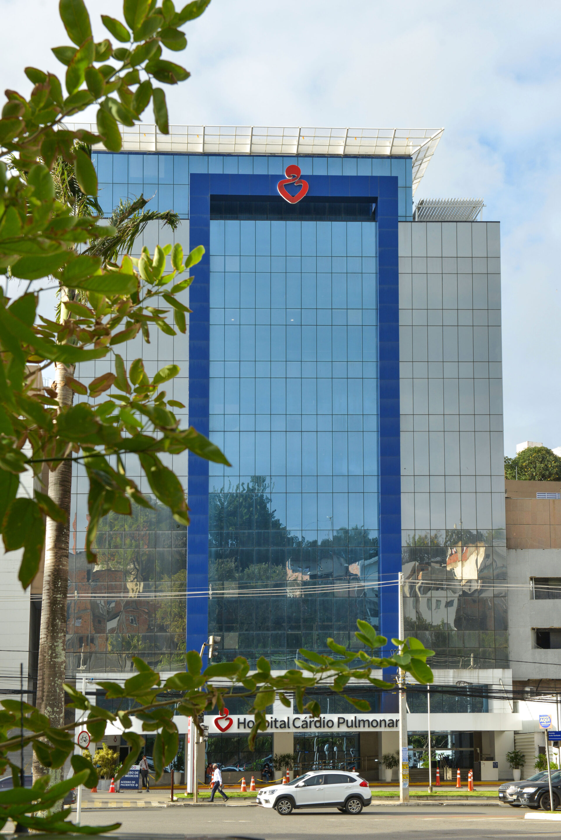
Hospital Cardio Pulmonar -
year
2019 -
location
Salvador / BA / Brazil -
architecture
PGC Arquitetura -
photography
Hermes Photo Films -
description
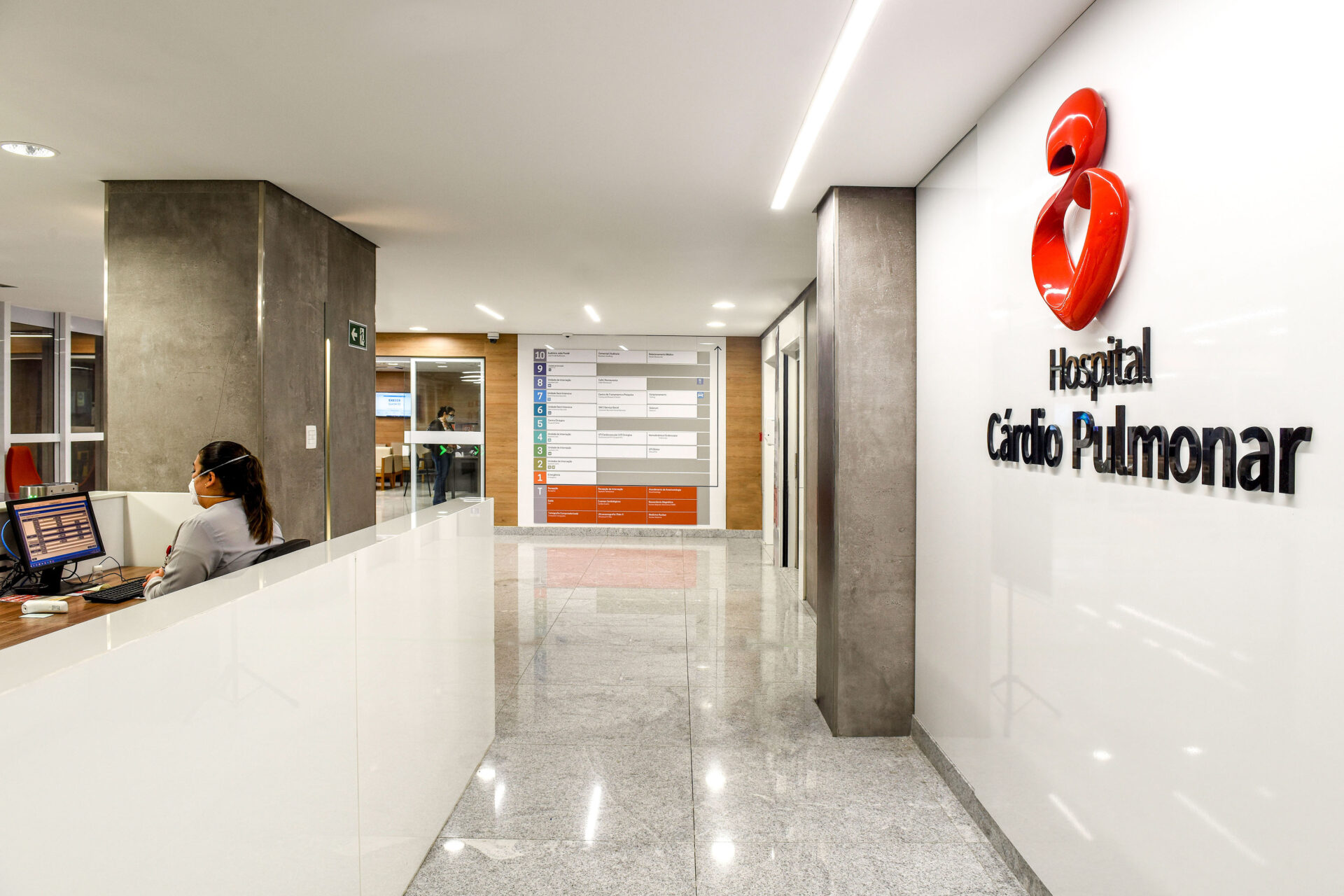
In 2019, Hospital Cárdio Pulmonar completed its expansion with the opening of a new building. Located on one of the main avenues in Salvador, Bahia, the hospital is a reference in the city in terms of cardio-vascular care. Its expansion has allowed the inclusion of other relevant sectors and medical services, thus enabling the reception of patients at all stages of life.
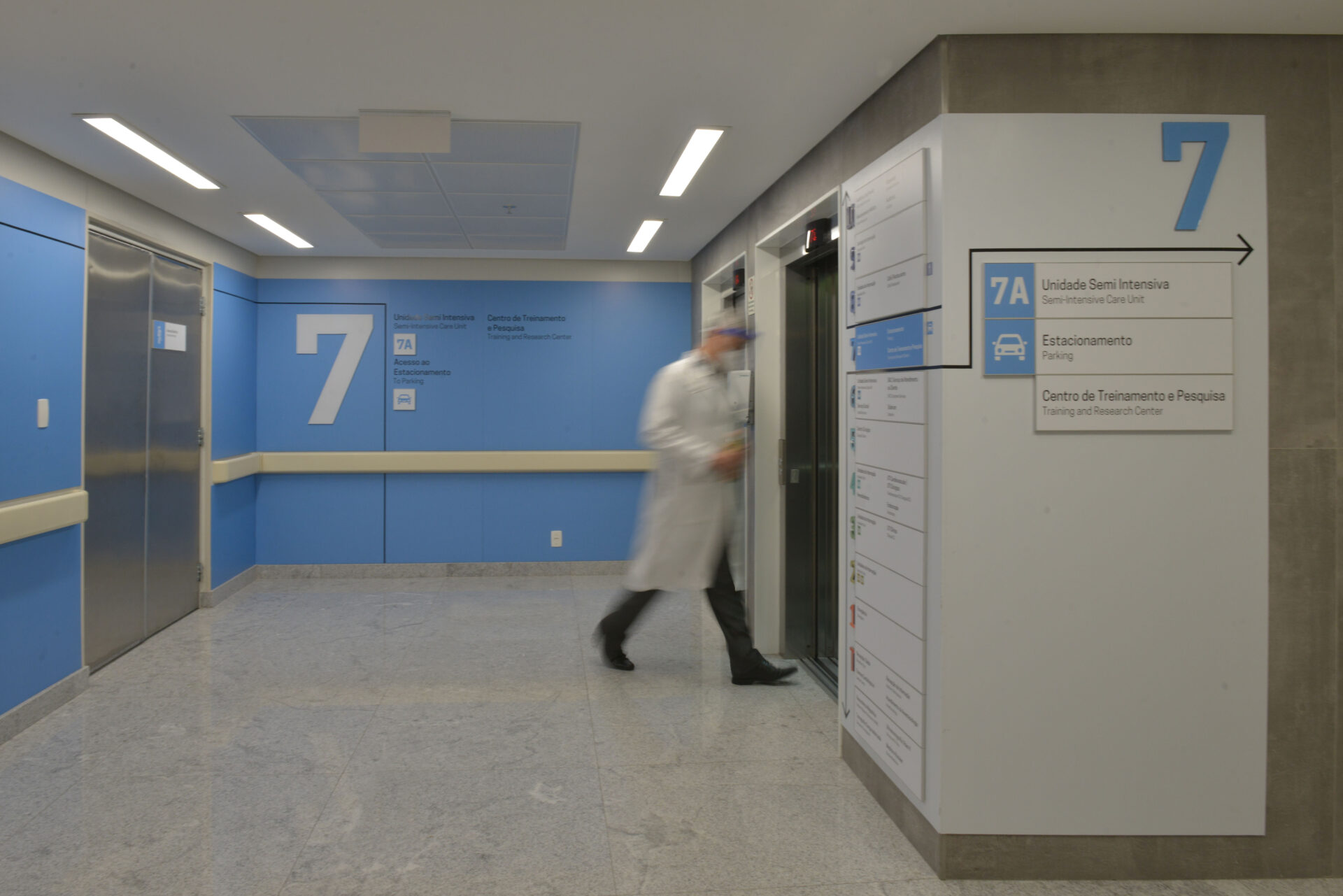
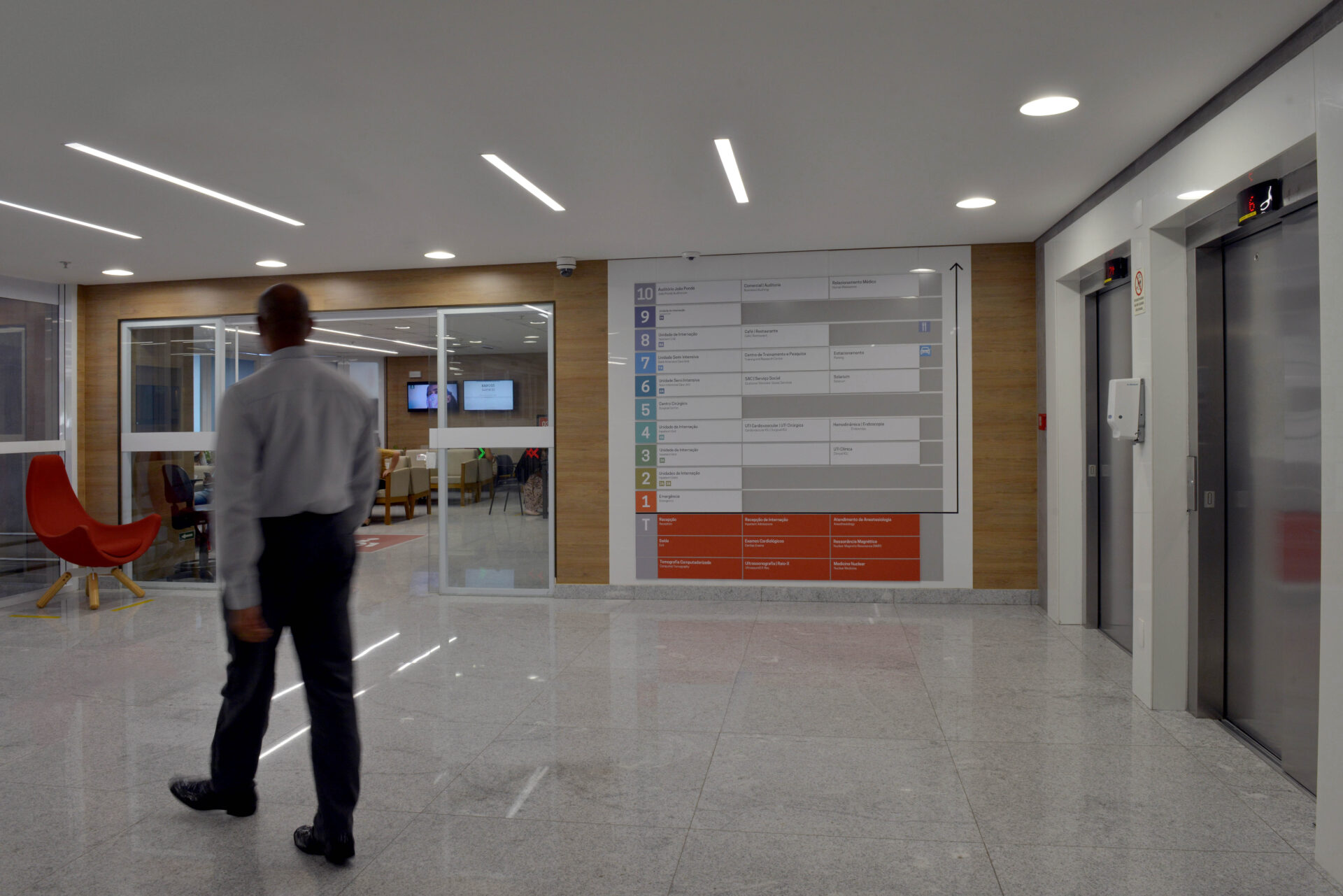
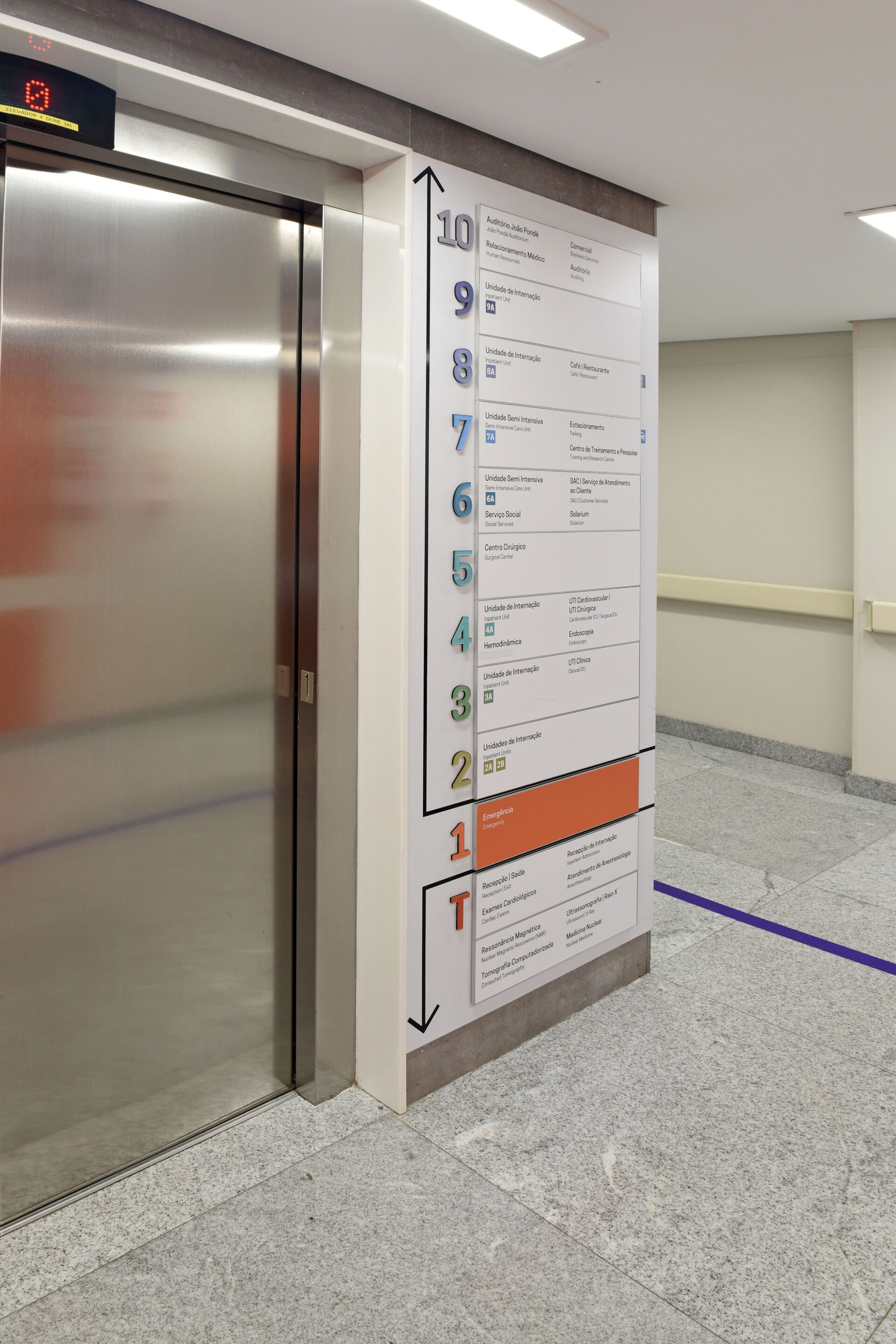
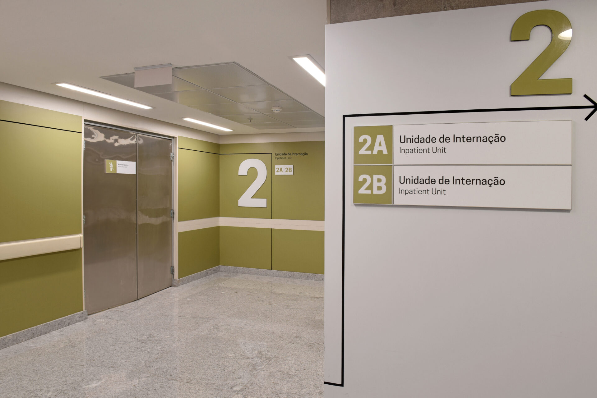
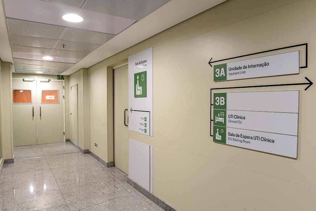
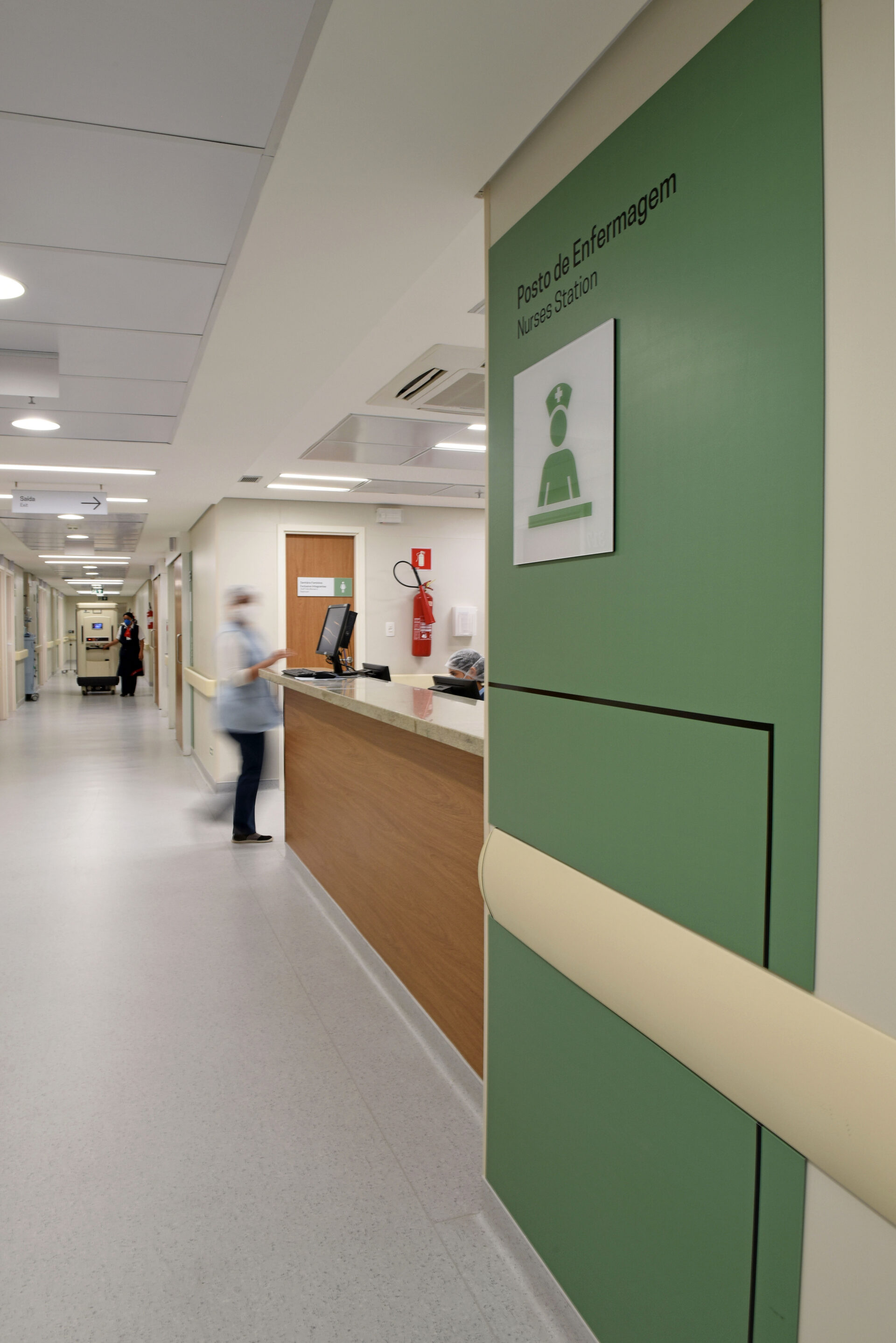
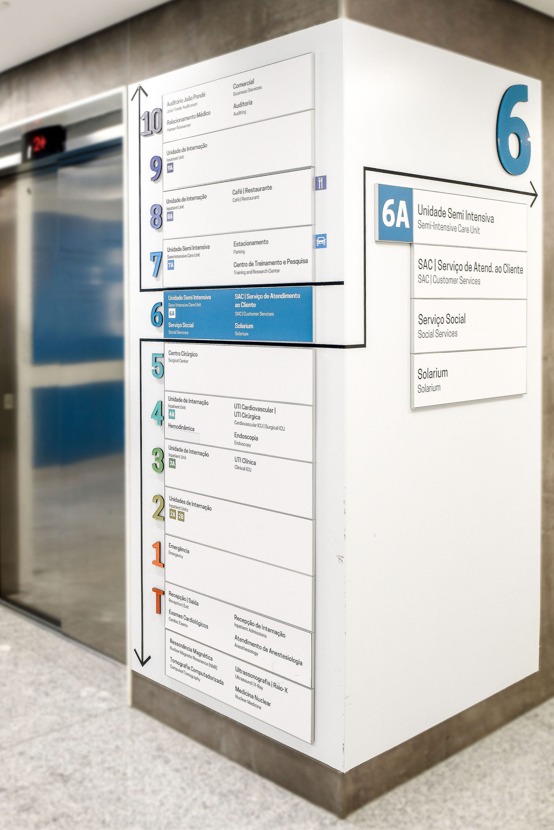
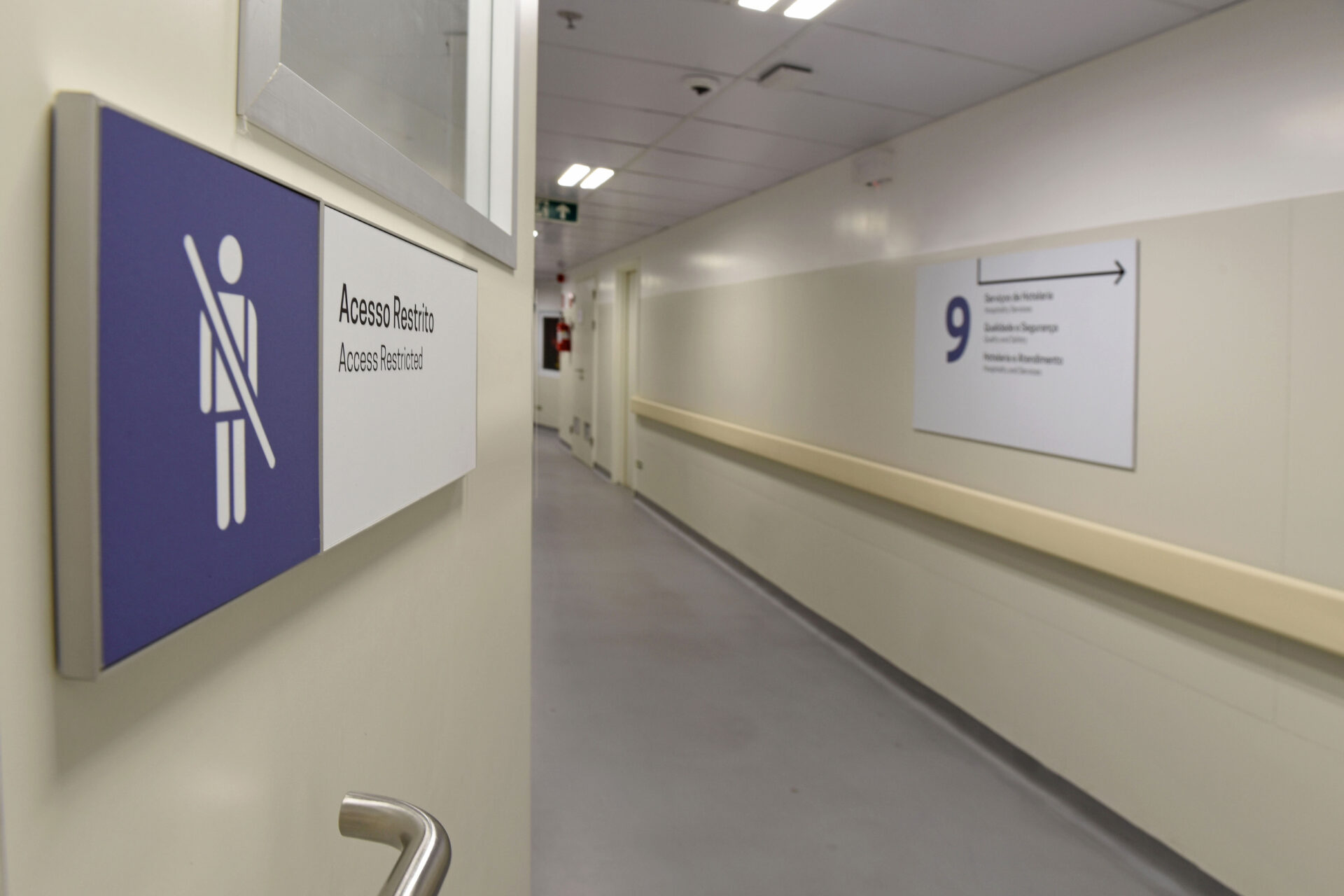
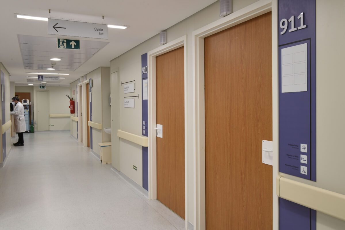
In healthcare institutions with great complexity, the Wayfinding Design challenge is to help patients, visitors, medical staff and employees to locate themselves in the space quickly and easily. For Hospital Cárdio Pulmonar, this flow was vertically simplified, as the Hospital’s sectors are distributed over 11 floors.
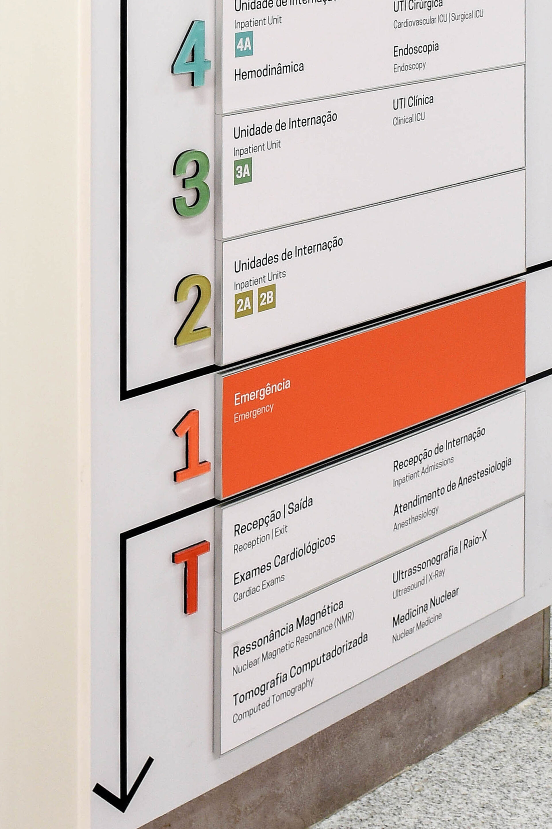
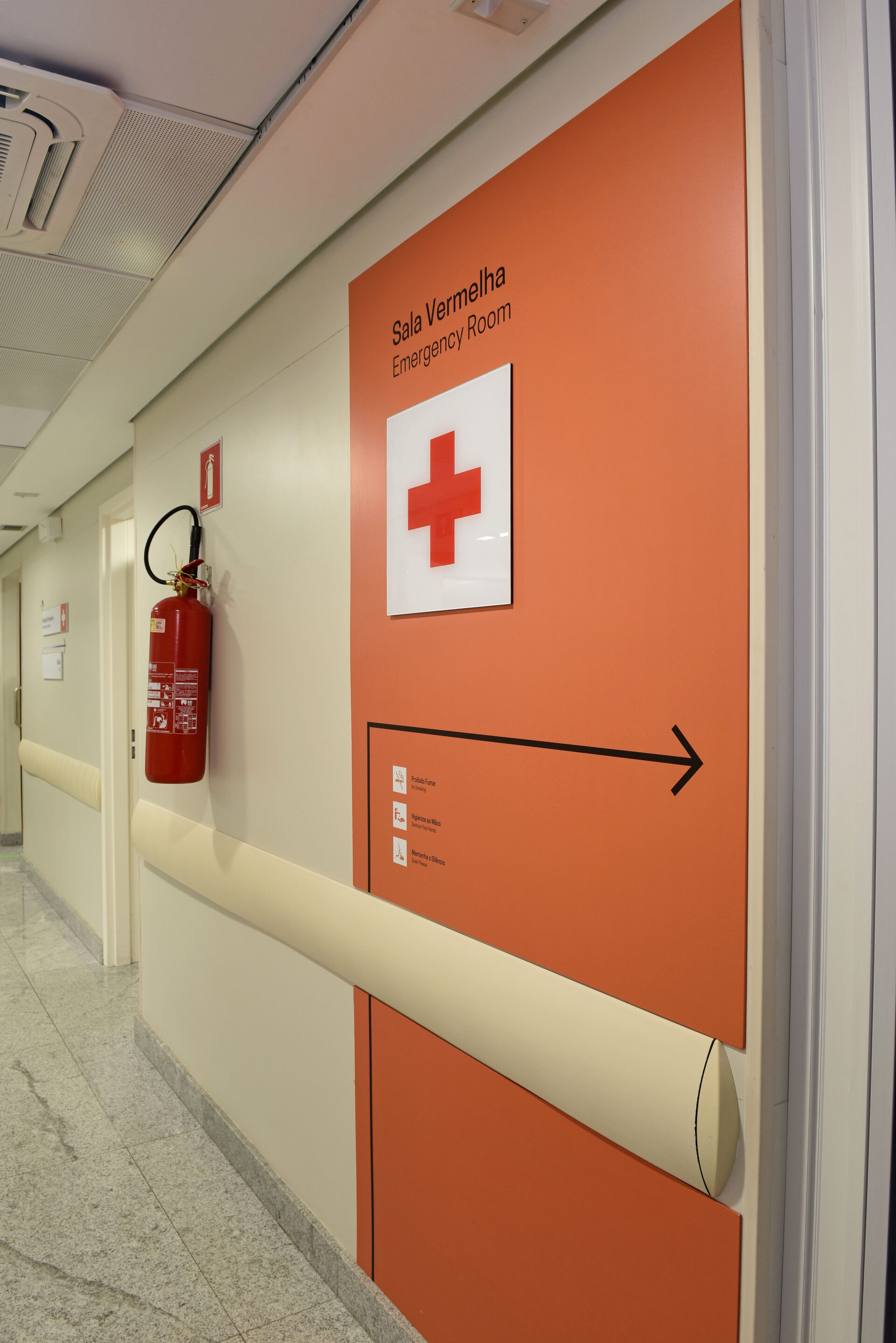
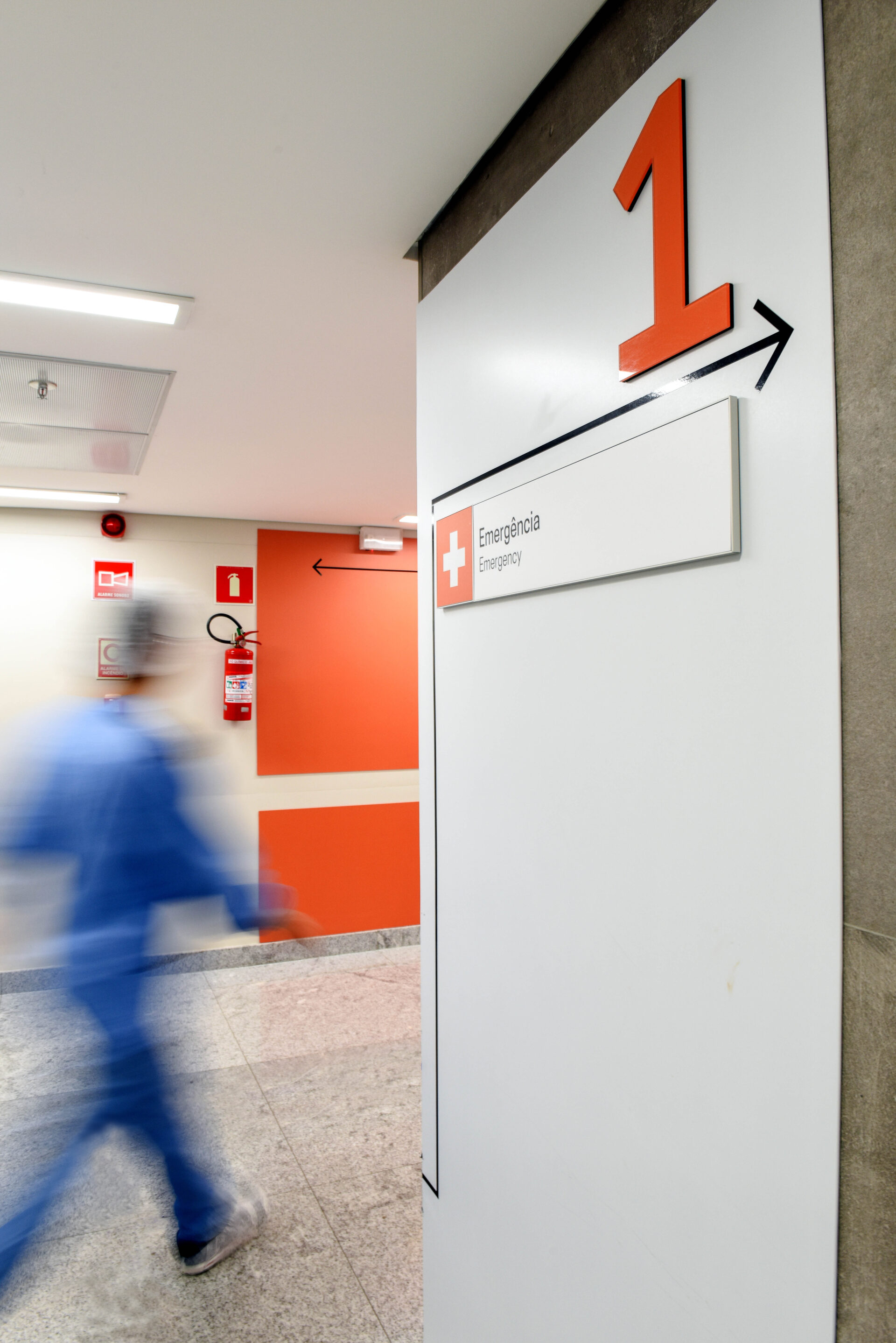
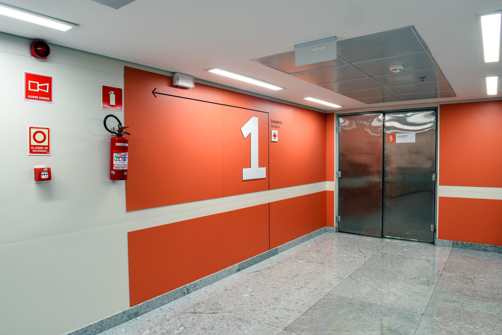
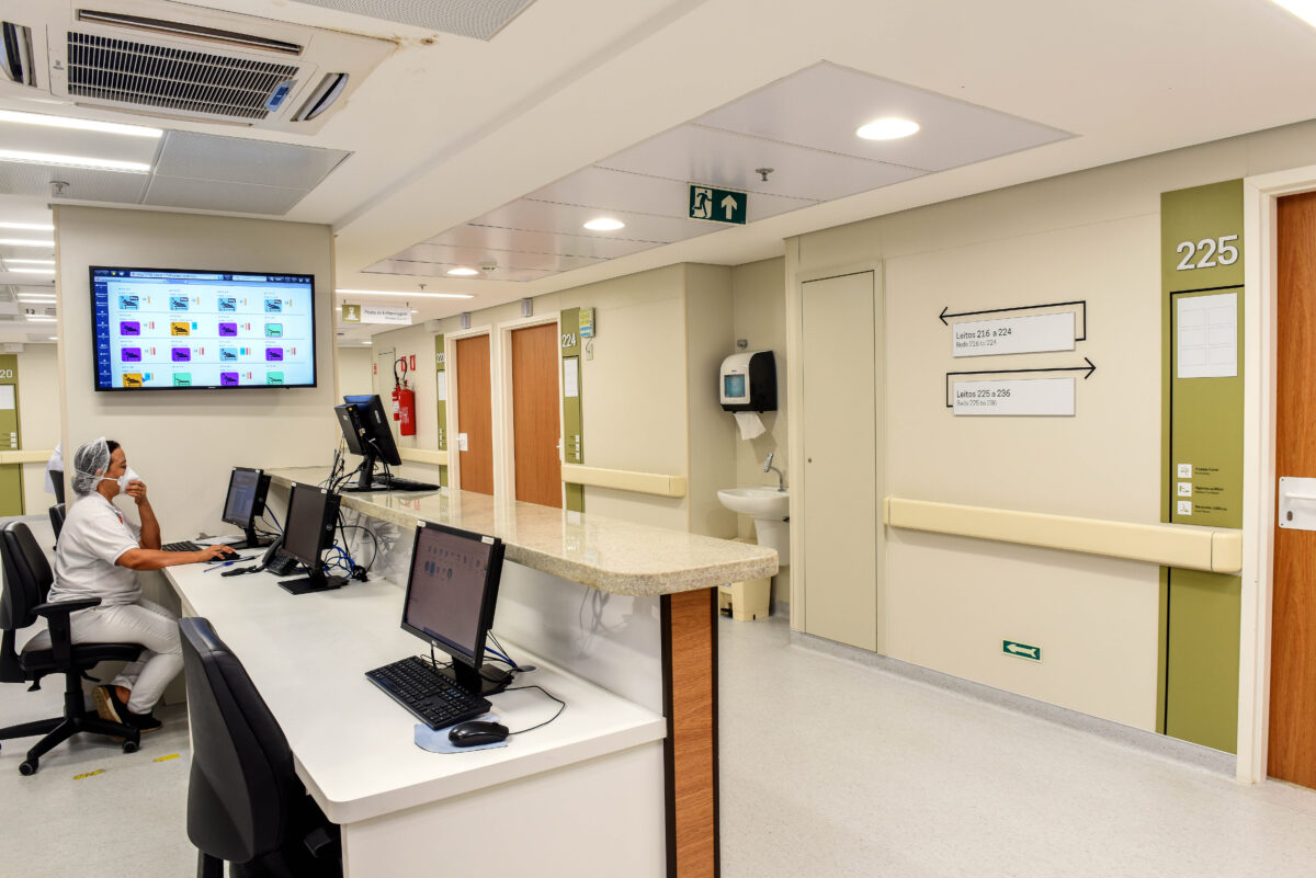
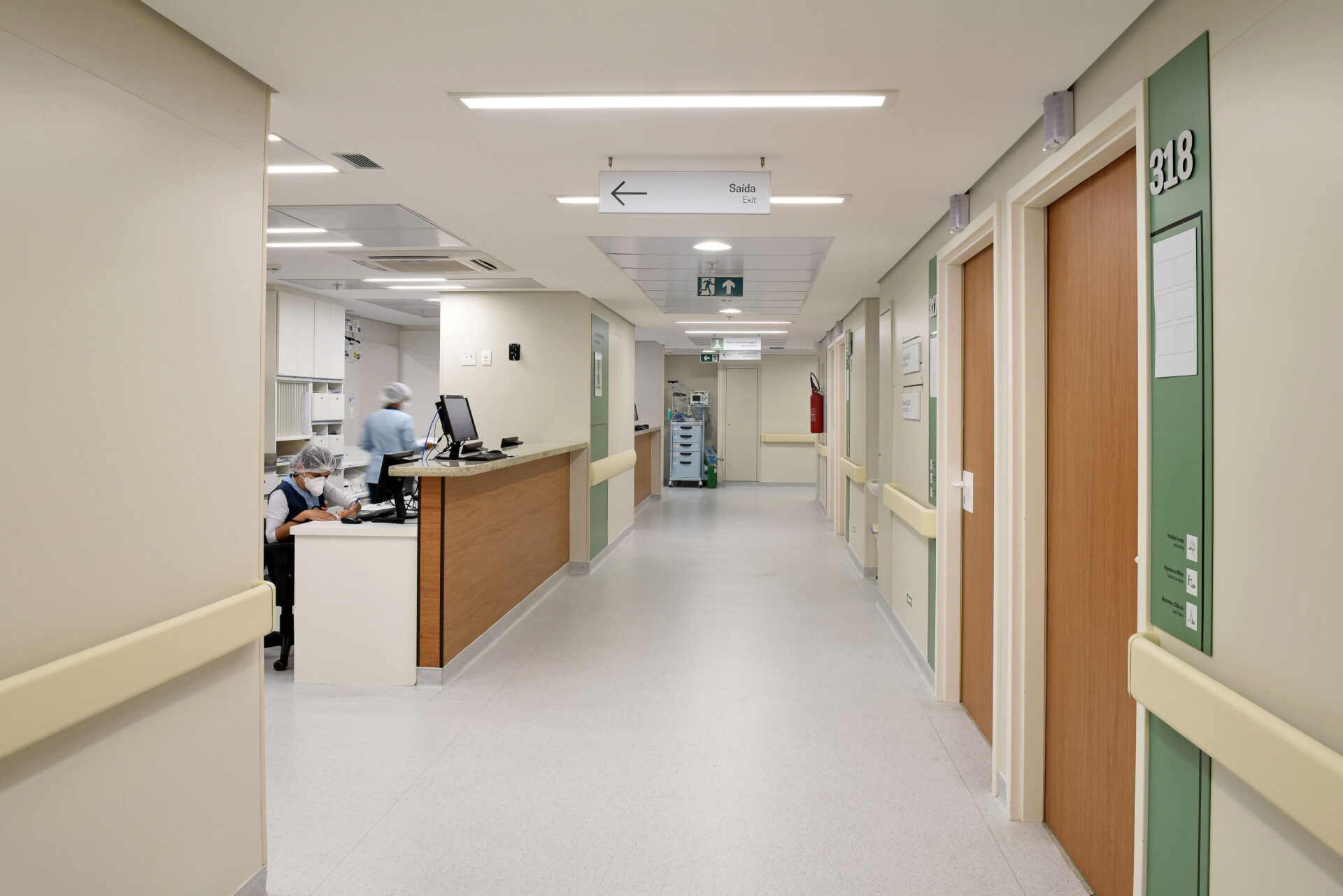
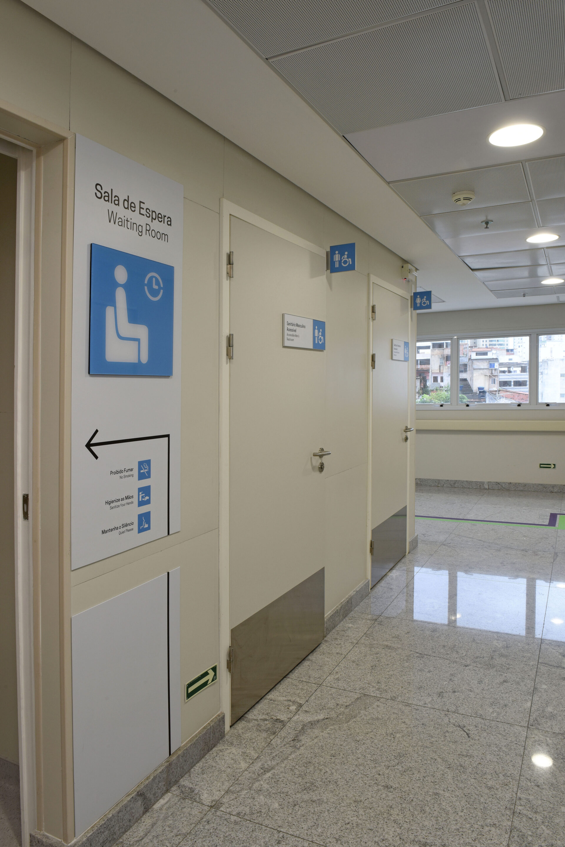
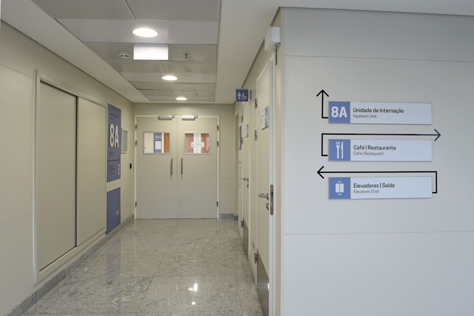
Aiming to maximize readability, the graphics system provides contrast by using information written in black on a white background. Color coding is the resource used for identification and ambiance of each floor, with color panels lining large areas of the elevator hall and serving as a display for information in the main wings.
In addition to this strategy that brings the hospital’s communication closer to people, the pictograms were customized and adapted to remain legible and universal, thus enhancing the wayfinding system’s visual identity and language.
Another premise for the project was the ease of maintenance and change of information. For this purpose, a modular system, which allows for quick replacement and changes, fits perfectly with customized solutions.
As a final result, it was possible to realize that, besides serving as facilitator for people to walk through the spaces, the wayfinding design, with its striking colors and large-scale numbers, managed to enhance the welcoming, trust and care atmosphere, thus contributing to the humanization of the space and to the sense of belonging that the public has towards the institution.